Stars_dataset
Murtaza Badshah
1/20/2020
Import the libraries to start the Data Analysis.
library(tidyverse)## -- Attaching packages --- tidyverse 1.3.0 --## v tibble 2.1.3 v stringr 1.4.0
## v readr 1.3.1 v forcats 0.4.0
## v purrr 0.3.3## -- Conflicts ------ tidyverse_conflicts() --
## x dplyr::filter() masks stats::filter()
## x dplyr::lag() masks stats::lag()
## x dplyr::select() masks MASS::select()library(dslabs)
data(stars)
options(digits = 3) # report 3 significant digitsLoading the Stars dataset from the dslabs package and assinging it to a data frame.
stars <- as.data.frame(stars)Mean & Standard Deviation of magnitude in the dataset.
mean(stars$magnitude)## [1] 4.26sd(stars$magnitude)## [1] 7.35Desity plot measuring the Magnitude in the Dataset.
stars%>%
  ggplot(aes(magnitude))+
  geom_density()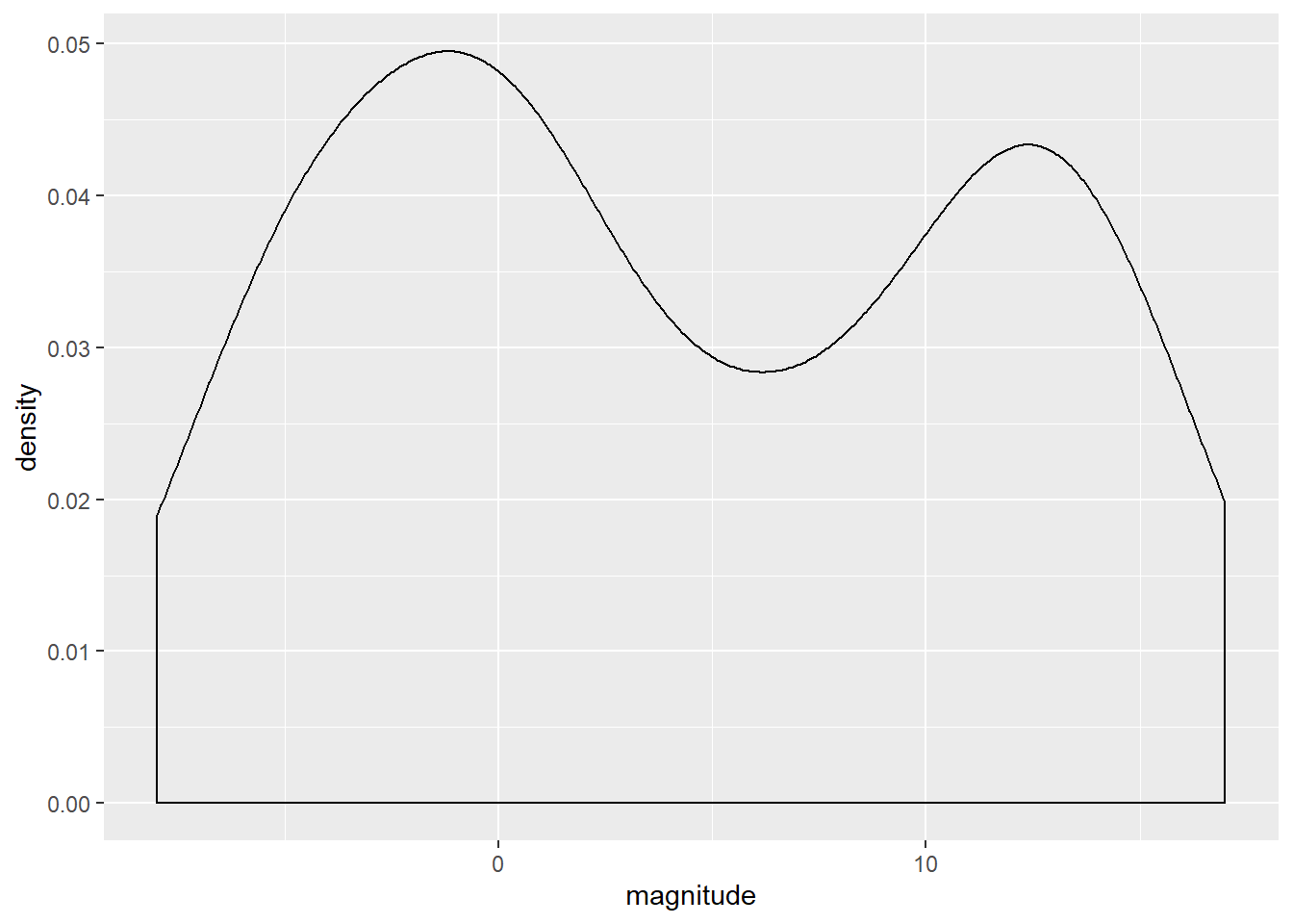
Desnity plot of the temperature to measure the heat density of the stars in the dataset.
stars%>%
  ggplot(aes(temp))+
  geom_density()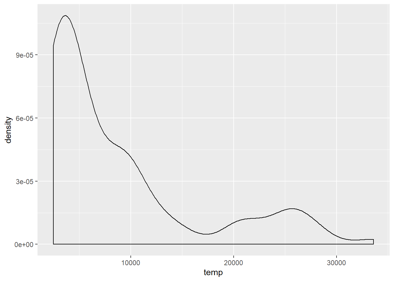
Scatter plot of the data with temperature on the x-axis and magnitude on the y-axis to examine the relationship between the variables. As we can see that there is a decreasing exponential trend in the line.
stars%>%
  ggplot(aes(temp, magnitude))+
  geom_point()+
  geom_smooth(method = "lm", se = FALSE)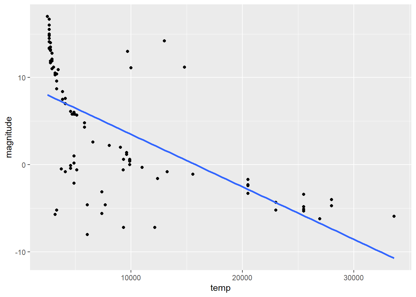
In order to interpret the graph better we are going to flip the axis to get a better understanding of the data.
stars%>%
  ggplot(aes(temp, magnitude))+
  geom_point()+
  geom_smooth(method = "lm", se = FALSE)+
  scale_x_continuous(trans='log10')+
  scale_y_reverse()+
  scale_x_reverse()
## Scale for 'x' is already present. Adding another scale for 'x', which will
## replace the existing scale.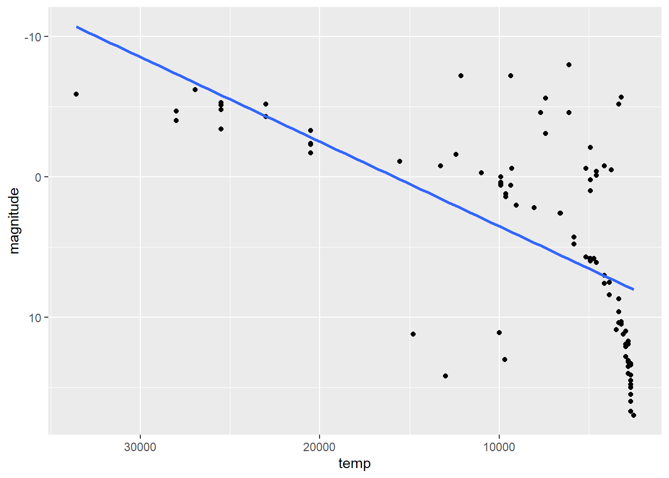
Here we are able to see that the brighter and hotter stars lie on the upper left side of the graph and the main sequence stars lie on the upper left center side almost close to the linear regression line.
Generally stars with hotter temperatures with higher Magnitude or lower luminosity are considered to be White Dwarfs we can outline them in the above graph as such.
wdwarf<- stars%>%
  filter(magnitude > 10 & temp > 9000)

stars%>%
  ggplot(aes(x = stars$temp, y = stars$magnitude))+
  geom_point(alpha = 0.2)+
  geom_point(data = wdwarf, aes(x = temp,
                                y = magnitude,
                                color = "red",))+
  geom_smooth(method = "lm",
              se = FALSE)+
  scale_x_continuous(trans='log10')+
  scale_y_reverse()+
  scale_x_reverse()
## Scale for 'x' is already present. Adding another scale for 'x', which will
## replace the existing scale.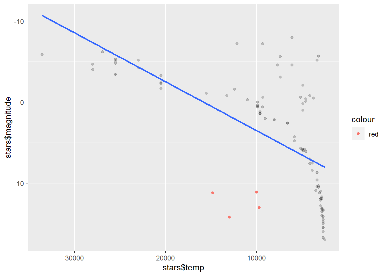
As we observe there are only 4 white dwarfs within the dataset. They have higher temperature and lower magnitudes.
In order to find the Red giant stars within the data set we will need to filter down the data a bit more. A hot giant usually has a lower Magnitude as well as a higher temperature.
rgiant<- stars%>%
  filter(magnitude < 0 & temp < 10000)

stars%>%
  ggplot(aes(x = stars$temp, y = stars$magnitude))+
  geom_point(alpha = 0.2)+
  geom_point(data = rgiant, aes(x = temp,
                                y = magnitude,
                                color = "red",))+
  geom_smooth(method = "lm",
              se = FALSE)+
  scale_x_continuous(trans='log10')+
  scale_y_reverse()+
  scale_x_reverse()
## Scale for 'x' is already present. Adding another scale for 'x', which will
## replace the existing scale.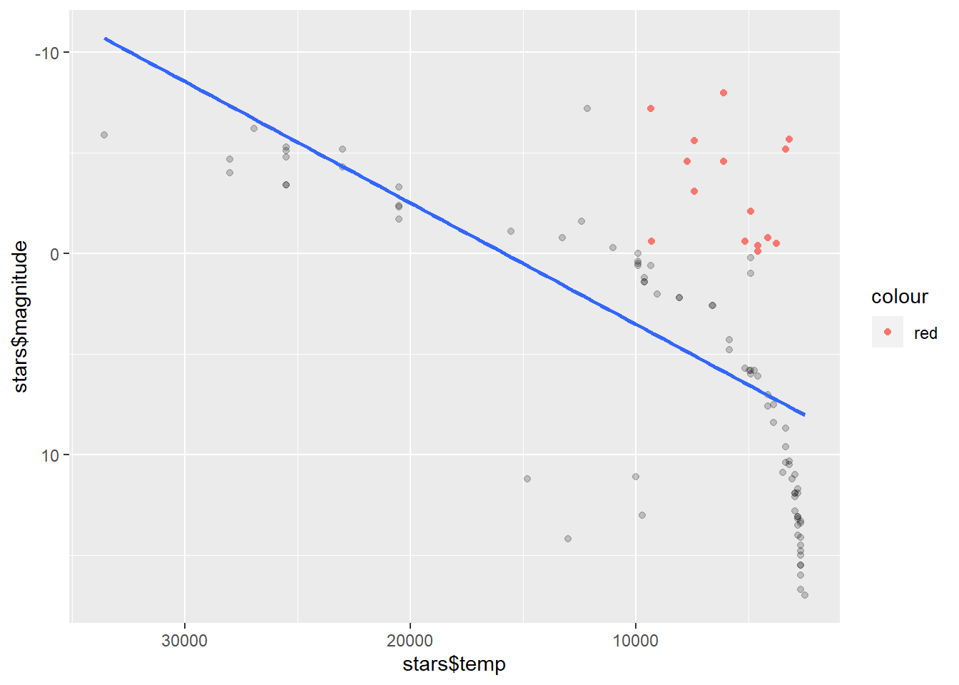
Add labeling to the graph to identify the stars.
stars%>%
  ggplot(aes(x = log10(temp), y = magnitude))+
  geom_point()+
  geom_label(aes(label = star,
                 color = "white",
                 ))+
  scale_y_reverse()+
  scale_x_reverse()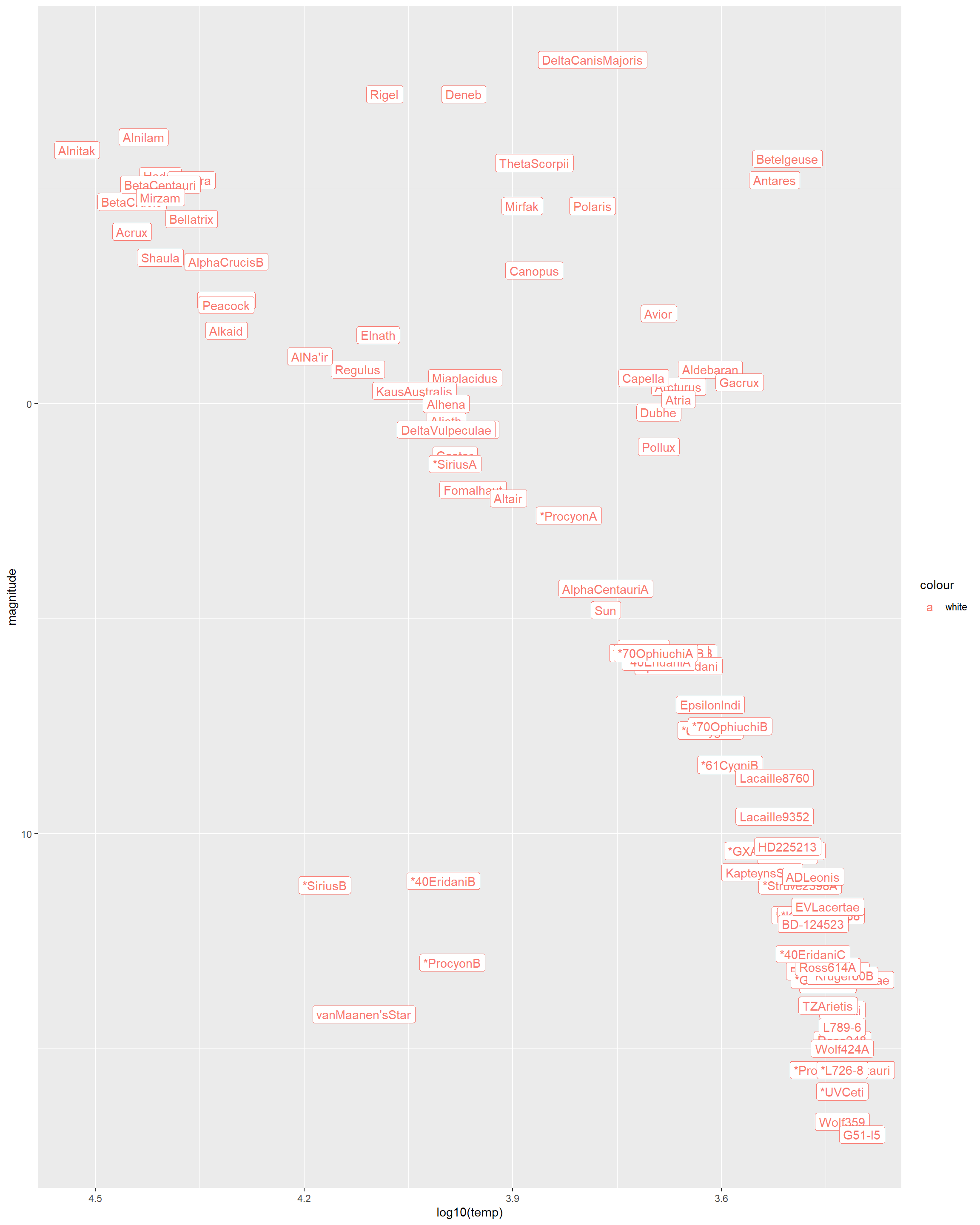
- The least lumninous star in the sample with a surface temperature over 5000K.
Based on the output we can pin point that the lowest magnitude with the highest temperature would be the vanMaanen’s Star.
- The two stars with lowest temperature and highest luminosity are known as supergiants.
The two stars are Beetlejuice & Antares
View the same data points without the label and colored by the type of star.
stars%>%
  ggplot(aes(log10(temp),magnitude, color = type))+
  geom_point()+
  scale_y_reverse()+
  scale_x_reverse()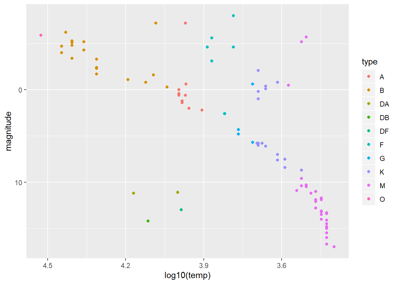
M type stars have the lowest temeprature.
O type stars have a high temperature.